Friday 26 February 2016

Week 7 Blog Post Eleni Pallotta

I personally consider the fieldwork of information research to take place anywhere where the researcher is engaged with or observing in the environment with the people, objects, etc. that they are researching.  In research, you often hear of the term “participant observation,” or observing what you are researching in their natural environment (Luker, 2010, 155).  Keeping this in mind, the question brought up by Alan this week that I find very interesting is how traditional notions of fieldwork change when the field is online or virtual.  I think that while the environment you are researching may not be a physical one, it is still a field where observation and possibly interaction can take place all the same.  You are still in an element’s “natural environment,” therefore, if this is the field your research needs to take place in it still seems to be a legitimate one.  My research, especially in my undergraduate studies, have generally been in a physical environment.  As an ECE, I have done much research that has required me to be in children’s homes, children’s classrooms, and so on.  Now that I am completing my MLIS, I found that my research requires me to change this traditional method.  I now want to have an online catalogue as my field of research.  The books are still there, technically, they are just on an online space rather than a physical library.  I will still get the same results that I would if I went to every branch and searched through every book on their shelves for the ones I needed, it is just much faster to search online. Ergo, the online world becomes my field of research.

Luker, K. (2010). Salsa dancing into the social sciences. Cambridge, MA: Harvard University Press.

Week 6 Blog Post Eleni Pallotta

While considering what significant things I've learned about the world that took the form of statistics, I found myself often coming back to the same thought: I've learned that statistics can often be subjective, therefore, what you might think is true about the world can easily be false if those statistics were not put into a greater context.  Let me explain in greater detail.  Consider the debates that have happened (and are currently still happening) around issues of global warming and climate change.  In a geography class I took at Ryerson, we learned of a debate that happened between scientists on whether sea ice in the arctic was truly disappearing.  My professor, David Atkinson, presented the class with two pictures that both showed satellite views of sea ice.  One was taken in 2007 and one was taken in 2008.  He presented the argument made by some scientists that since more ice could be seen from the picture in 2008 than the picture in 2007, sea ice wasn't really melting because there was more sea ice the year following 2007.  Atkinson explained that what these stats didn't tell you was the difference in quality of sea ice.  Multi-year sea ice is thick ice that lasts all year round for many, many years.  This is the ice that many animals like polar bears rely on to hunt and survive in the arctic.  Although the 2008 picture showed more ice than the 2007 picture, the ice shown was NOT multi-layer sea ice, therefore, it was thin and would likely melt away within the same year it was made.  I believe that this is just one example of how statistics can seem to prove something, but really are made by subjective opinions that haven't been put into greater context (possibly to deceive others around them).  I personally think that stats like this have a human resonance because they affect every person on the planet.  Our earth's climate and all the species that inhabit it (including humans) are facing an uncertain future.  Stats need to prove the reality that climate change is happening and we need to prepare for it; not lessen the impact it is having on, for example, multi-layer sea ice.


"Hypothetical sea ice dynamics scenario showing some of the most common sea ice features" (Retrieved from https://en.wikipedia.org/wiki/Sea_ice#/media/File:Sea_ice_Drawing_General_features.svg)

Week 6: Data and the Challenger Disaster


In his book Visual Explanations: Images and Quantities, Evidence and Narrative (1997), Edward R. Tufte tells the heartbreaking story of the Challenger Disaster of 1986, and how he thinks that it could have been prevented with a the help of a better presentation of data. Apparently the scientists involved were aware of the potential O-ring failure responsible for the explosion, but chose to proceed with the expedition anyway. Tufte argues that the way that the data was displayed did not adequately communicate the potential risk, including the fact that the flight crew were listed as data and not people. 

I definitely see the benefit of data and statistics, but I think it is ethically essential to be aware of the context, the audience, and the implications of the way that it is presented, especially when the welfare of others is at stake.

References:

Challenger Disaster Live on CNN. (n.d.). Retrieved February 26, 2016, from https://www.youtube.com/watch?v=j4JOjcDFtBE

Tufte, E. R. (1997). Visual Explanations: Images and Quantities, Evidence and Narrative. Cheshire, CT: Graphics Press.

Week 6- Statistics


Statistics are perceived to be cut and dry facts, because numbers are objective, duh!  Except this is not always the case.  Numbers tell a story, but the kind of story they tell is not as objective as we like to think.  The information we extrapolate from data may depend on the answer we're actively looking for.

I find that statistical data is often taken at face value by the general public, which is alarming because not all data is created equal and there are cases of misleading or straight up fabricated statistics we see every day.

Did you know that 80% of dentists recommend Rosebrugh brand toothpaste?  Well, who are these dentists?  How did we find them?  Who did the research?  What wording was used in the questions that led us to this stat? (Obviously a fake stat, I do not own a toothpaste brand...yet...)

I felt I had to get that little rant out of the way before addressed the actual questions this week.

The truth is that I rely on statistics and find them very effective and illuminating.  The stories told in numbers that are the most impactful for me are ones that quantify inequality and oppression.  I think that's because it gives me a sort of tangible tool when discussing issues like racism, that can be invisible to those who are privileged enough for it to not be a part of their life experience.  For example, someone might argue that racism is no longer an issue.  Which is impossible to believe if you look at the statistical breakdown of how race impacts rates of incarceration, police violence, poverty etc.  (The lesson here is, don't try to argue with me unless you've done your research.)

One story around statistics that really taught me about the human story behind the numbers was shared with my first year sociology class.  My professor informed us that 18 years after Roe v. Wade, rates of crime in the United States had dropped significantly.  It wasn't because police were doing such an amazing job or people just didn't want to break the law anymore.
It was because children who are unwanted or who have parents unable to provide them with proper care have an increased likelihood of being involved in criminal activity, which tends to be around 18 years of age.  Because women had the right to choose, their unwanted children weren't born and weren't exposed to the risk factors leading to criminal activity.
The crime rate data 18 years after Roe v. Wade had a very interesting human story behind the numbers that has stuck with me 10 years later.

Thursday 25 February 2016

Statistics

I honestly haven’t had any moments where statistics have “struck home” with me. I do remember the last statistic that I found interesting though. I was watching a documentary on Netflix and the narrator mentioned that at one point hunting brought the number of Bengal Tigers in India from 40000 to 1800 (Wildest India on Netflix). National Geographic says that there are now fewer than 2500 Bengal Tigers in the world, which is upsetting. These statistics don’t have much of a lasting impact on me though – I’m not out trying to save the tigers or anything.
I also really like XKCD, a webcomic that sometimes has comics on statistics that are really interesting or cleverly presented. I’ve posted two examples (one joking and one serious)


Week 6

Often times, numbers and statistics are a necessary tool in driving a story home. We exist in a world that's filled with over seven billion people. I don't know about you, but I find this number impossible to envision. In cases like these, I find that statistics, while often eye opening, can be incredibly intangible. This is why I find it so powerful when numbers are boiled down to something easily imagined. A fellow blogger posted this link in a comment: http://www.100people.org/statistics_detailed_statistics.php. In taking statistics that are true for the entire world's population, but framing it in regards to 100 people, these statistics become more meaningful because they're more easily understood.

I think it's easy to become consumed in one's own existence. By this I mean that we get comfortable with our immediate surroundings, and we believe things that are true in our context. If there's anything that can bring us out of this bubble and shift our perspective, it's numbers. As an example, living in Toronto, I'd argue that we are aware of multiculturalism. However, I'd also argue that most of us think of English as a dominant language in the world. Taken from the website posted above, only 5 out of 100 people (so 5%) of the world speaks English as a first language. This type of statistic has the power to shift our perspective - it makes me hyper aware that there is a giant world out there.

Stories Told in Numbers: The Changing Classification of Humans

What I find extremely intriguing is the statistics of human demographics and censuses. I find the area of statistical demographics to be somewhat controversial now. For example, questions of ethnicity (race), gender, and sexuality have taken an extreme turn over the past decade. Statistical Demographics makes me think of Hacking’s theories about the classification of people. Hacking believes that humans create a classification system that puts people into categories. Hacking suggests that we need these categories to keep order in our world, that like baseball, statistics are necessary to predict what will happen next because mankind is in fear of the unknown.


Nonetheless, I feel like our classification system of humans (and therefore our forms of statistic demographics) is becoming blurred. With the rise of blending categories, such as transgender (or not identifying with a gender), mix-races, LGBTQ sexualities, cross-cultural identification, and more, our need for this basic information like gender, sex, or ethnicity is becoming hard to identify. We cannot organize our populations into rigid categories anymore; instead we have a more fluid population. I am not sure if now there are new ways to categorize people, if we invent more categories if it will make sufficient impact on the data that is collected, or if demographic statistics need to be modified to fit a certain area. Also, does this factor that we now can no longer fit people into rigid numbers (or classes) something we should be afraid of? Or is the grey area of unknown mean that we have progressed as a society to be adaptable and accepting? Obviously this does not apply everywhere, but the changing nature of human demographics makes for an interesting case. And then of course you have the futuristic dystopian societies that revert back into this idea that in the end, everyone is just a number and only few can change this.

Wednesday 24 February 2016

Week 6 Data Visualization (Althea)

Infographic for World Carbon Dioxide Emissions by Country
Source: http://www.example-infographics.com/world-carbon-dioxide-emissions-by-country/

I love the idea of data visualization and especially enjoy looking at infographics. When done right, infographics are very effective in conveying statistics and invoking thought. Infographics with good design and attractive colours are also good at attracting and maintaining the interest of even those who don't consider themselves particularly good with numbers and data. For example, this infographic that I have chosen has a circle representing each country, and the size of the circle corresponds to the amount of carbon dioxide emissions. In addition, the colour and placement of the circle reflect the country's location on the world map.

With the infographic above, I found it particularly interesting that my home country, Singapore, produces more carbon dioxide emissions than Malaysia, its neighbour that is at least 450 times larger in land area. Canada's emission is also a lot lesser relative to that of USA. The information on this infographic is now outdated, so it is interesting to wonder how a current infographic of the world's carbon dioxide emissions will look like. Will China's circle be significantly smaller considering its slowing growth? Will a developing country's circle get bigger once production work gets passed off to them?

For an example of what else infographics can be used for, check out this free, printable poster: http://dirkloechel.deviantart.com/art/Size-Comparison-Science-Fiction-Spaceships-398790051. It was a passion project created by someone who was simply interested in comparing the sizes of sci-fi starships, and it is mindblowing.

Tuesday 23 February 2016

Week Six: Statistics

While reading Noe’s article, I couldn’t help but be skeptical of the explanation given behind the reason for writing down play by plays. Historically, baseball games were broadcast via the radio. I’ve always thought that scorekeeping came out of the need for a visual stimulant while listening to the audio feed. Not everyone is an audio learner. Having a visual key to the game keeps you physically in contact with the game, both tangibly and visually. Personally, I find watching baseball boring enough. I cannot imagine being riveted and alert for hours upon hours listening to it on the radio. Maybe this is just me ...

On an unrelated note, I recently had a conversation with a friend. We were discussing Islamophobia, and how overrepresented crimes perpetrated by Muslims are in the media. We came across this eyeopening article:


I highly recommend quizzing people/self-quizzing! It’s shocking and eye-opening. I was quite wrong with some of my statistical guesses. How did you fare? 

Week 6 Blogging Question: Stories Told in Numbers


Yesterday, I came across this spoken word montage titled "MAN vs EARTH", by poet Prince Ea, in which he drops some "fun facts" about our favorite ball of blue and green. He mentions that the Earth has existed for four and a half billion years, while humankind has only been around one hundred and forty thousand years. He then puts those numbers into perspective, framing them to give us one very interesting statistic: if the Earth's lifespan was condensed into 24 hours, then we would have lived on it for all of... 3 seconds. 

Boom.

I would assume that this information was derived by condensing the years that the Earth and humankind have existed, while maintaining the ratio. Prince Ea succeeds in communicating the data in a way that has more impact, using measurements of time everyone understands (for example: not everyone can properly conceptualize just how long 4,500,000,000 years is).

It was sobering to be presented this data in such a comprehensible way (I say this because I deal with hours, minutes, and seconds, on a daily basis). Humans have had such an incredibly detrimental effect on the planet despite the short time we've been alive (just three seconds!?). We suck.

Monday 22 February 2016

Week 4 Daisy


For this exercise I found my terms to be pretty broad. I would like to expand on them and break the categories down into something like a mind map. I think also throughout my research the focus on each subject will change, one will become more important and the others less. However, it is nice to draw some sort of outline that encapsulates the basic content of my research of anti-doping education. I also like the idea of getting creative and drawing out your research.

Friday 19 February 2016

Week 4 Blog Post

Like others have posted previously, I can definitely see the value in this exercise, but I am not necessarily sure that it is suited to me. I wrote all my search terms down in a list before attempting to draw the daisy (looks more like a poinsettia?), and just writing them down at all was useful. But who knows, I'm a compulsive doodler when it comes to taking notes, so maybe I can kill two birds with one stone and use my notebook margins for both flora and brainstorming space.

Wednesday 17 February 2016

Week 4 Blog Post Eleni Pallotta

While I can see why Luker emphasizes this exercise as a way to organize ideas before beginning secondary literature research, I personally found the activity to be a bit more of a nuisance than useful.  I prefer writing lists when brainstorming ideas and actually had to do that before completing my daisy.  I then made a daisy twice (the picture above being my second attempt) and still couldn’t get my ideas perfectly into a pretty flower.  I appreciate this activity for showing a flow to ideas and how they overlap with one another, however, I personally would not make a daisy diagram again.  Writing words in a circular shape works best for me, and then I don’t have to count to make sure I have enough petals for all my words.  Also, I don’t have to make a whole new diagram if I want to add/remove a word like I would have to with a daisy diagram.  Still, this exercise was a good way for me to brainstorm subject terms I can use when finding articles so, it that sense, it was helpful.

Sunday 14 February 2016

Week 4: Bedraggled Daisy


This is my daisy! I did not find this way of mapping to be very helpful. It is my belief that knowledge organization is a very personal thing, and I rarely adopt a certain method of organization. Instead, I prefer to take bits and pieces of things and use it in my own way. Let me put it this way: if I were a famous writer, and I died without publishing the last instalment of my novel and it lay complete yet unbound somewhere in my house, no one would be able to find it. Ever.

I rely on notes by my bedside table (I often wake up in the middle of the night, struck with inspiration), on my iPhone, my computer (I use GoogleDocs, the sticky notes, and the notepad, EverNote, and Word). Nothing is in order to anyone but me. I don't want to spit on the bedraggled daisy because it obviously works well enough for Luker to suggest it to us. More power to whomever it helps!

Friday 12 February 2016

Week Four - Bedraggled daisy (Althea)

I found the exercise useful because it forced me to identify the areas of research that has been done and areas that I could find more information for when I plan out my own research. However, like many of you, I found turning what I know into a daisy tedious. I definitely feel more comfortable with making annotated lists, which was what I did before I placed and organized that information into a daisy.

Also, depending on how much area the research intends to cover, there may be a lot of petals! Based on my own experience trying to fit these nine areas into the picture, the process may take a lot of time and the end-product can come out messy. In my opinion, people can try different methods to organize their work, but they should do what they feel most comfortable with.

Week 4

I appreciate (and almost always use) visual representations when mapping out an essay, a topic, or an argument. As I understand it, creating this bedraggled daisy should help folks organize and explore their research. However, for these purposes, I feel as though it's an ineffective activity.   My personal preference for visual representation of ideas is a mind map, where I can organize ideas in relation to each other. A mind map allows you to connect ideas to one another so that you can see common and overlapping connections. In contrast, the daisy forces you to try and fit all of your ideas into a daisy - it would be really difficult to add petals after the fact! For this reason, I found this daisy activity more limiting than anything.

In any case, here's my bedraggled daisy: 

Bedraggled Daisy Exercise


I found the daisy activity to be an unproductive way of writing out my ideas. I would much prefer to put them in a list, actually having to draw a flower seems a bit silly to me. My “petals” would be more easily groups into categories, for example people (teenagers, high school students), places/institutions (public library, high school library), and methods (mapping, tracking, usage). The idea of looking up research papers by combining petals is a good idea, but I would prefer to use my categories because it allows me to see what groups I am looking at more easily.


Thursday 11 February 2016

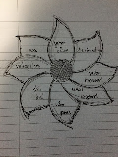
Week 4 - Lesley Rosebrugh draws a bedraggled daisy.

Believe it or not, this is the best of my numerous attempts at drawing a bedraggled daisy.
I thought to myself,  "I'm a reasonably capable adult and can probably knock this daisy out in no time!  How hard could it be to draw 8 interconnecting ovals?"
8 grotesque daisies later...

I see the value in Luker's (2008) exercise and I understand people find visualizing concepts to be helpful.
Personally, it didn't do much for me (other than remind me of how I almost failed art that one year...)

When researching a subject, I will make lists of key words and variances of those words (for search engines that shun truncation *shakes fist*) and use a variety of combinations until I find what I'm looking for.  If I were to actually input all of these terms into the daisy format, it would be an indiscernible tangle of madness.  Luckily, I had already gone through the process of searching for literature related to my research question and had a paired down list of key word combos that got me to my sources (Toronto didn't really help me to be honest).

There's got to be a better way than the bedraggled daisy for us to visually organize the intersecting subjects of our research questions.  Maybe some kind of colour coded web of lines?  That might only take me 3 or 4 tries :)

Tuesday 9 February 2016

Week 4: The Bedraggled Daisy

I was kind of uncertain about the usefulness of Luker’s exercise in this chapter. From what I gather, the point was to create something of a “frame” for my research. 

Don’t get me wrong, I understand the benefits of visualization. Using the right creative tools can certainly jumpstart individuals when the process stalls, but this didn't really help me (that's not to say it can't help someone else!). All the daisy seems to do is paint a pretty picture, showcasing its disk floret as the intersection of all fields pertaining to my topic, which is something I could have done just as effectively by simply circling those elements in a top-down list.

So in that sense, there was probably a better way of framing my work

And as for the secondary purpose of say... identifying intersections of fields and entry points, it was still a bit ineffective. The ordering of petals is arbitrary using this model, and it might have been more useful to have a visual tool for reminding us about intersections between all possible combinations of “leaves”, rather than being restricted by a daisy framework (if you have more than three leaves it becomes harder to see overlap between each and every leaf).

It may not be the method for me, but I did draw a flower regardless! It’s comprised of all the elements I feel are big areas I’ll be touching upon in my research proposal. Please don’t mind my artistic ineptitude.


I do think Luker’s daisy framework would have been useful as a “brainstorming tool”, inserting leaves as more important areas you wanted to cover came up, and then eventually finding your prize of a research question hiding in the center. But as of right now, I already have a pretty clear idea of the research question I’d like to pursue.

And I hope that research question can be somewhat ascertained through my flower (I hope?).

Friday 5 February 2016

Week Three - Epistemology Quiz (Althea)

According to the epistemology quiz, I am Jürgen Habermas. I cannot say I'm surprised at all, since I do have an background in anthropology, and the core lessons in socio-cultural anthropology are almost always about how us to how our biases will always be contained within the decisions we make and the analyses we choose to use. However, I am also unsurprised because the answers were ones I have actively chosen.

As mentioned before, I made the choice to be schooled in contrasting disciplines. I may have chosen to major in anthropology which teaches its students that there is no such thing as objective knowledge, but I was also born and raised in a society that placed more focus in scientific education and have spent more time analyzing things with a scientific lens. So while I chose to pick answers that were more reflective of social science background, I could also see myself picking answers that would be more reflective of an empiric epistemology.

I would say that my issue with quizzes like the one we did is that they are always designed to place the individual in a single category even if the said individual has multiple leanings. I don’t intend to do the same quiz more than once, since getting multiple results don’t necessarily mean anything. What will learning that you may have the epistemology tendencies of more than one philosopher do?


For my research, I intend to find out if, and how, new technological resources and the abundance of travel information have affected the traveler’s experience. Since this is a topic that investigates how people share and use travel information and knowledge, my research design will revolve around the discovery of the traveler’s experience during their planning and travelling stages.  I would like for my research to inform knowledge creators on how to create and share better information, and to make information users more aware of how they choose to interact with information.

Thursday 4 February 2016

Week 3

My result: Foucault

This result makes sense to me. All of the answers that stood out to be all concerned power relations and society. I think the role power, especially when it comes to knowledge, is an incredibly important factor. It is important that we consider issues like who controls knowledge, who decides what knowledge is disseminated widely, and who creates knowledge? It is also important to recognize that no matter what issue we are researching, it will affect groups of people differently depending on their status and position in society.

This survey is definitely far from perfect. If someone knew all of the possible results of this survey, they could definitely spoof it to get an answer that they want. The answers follow consistent themes. As an example, most of the answers leading to Foucault were related to power relations and taking into consideration a person's status in society. There is also a set of answers that lends itself to objective science (these answers lead to Francis Bacon, who "has a bit of a thing for scientific method", and enjoys empirical research). However, since the results of this survey don't hold serious statistical consequences, it does serve it's purpose.

Week 3

Result: You are Jane Addams!

You are a scientist who believes that social research should be combined wit action so as to enact reforms. You are impatient with social science that is uncoupled from implementation. You believe that the value of the claims made by your research derive from the practical consequences that follow from them. This means you do not settle for generating new insights into the human condition. Instead you seek to solve social problems through research. You believe that social science research that is unleavened with compassion for those in need rarely comes to good ends for society. Go conquer the world you pragmatist!

My quiz results don’t surprise me. I didn’t have a particular person in mind, but the description seems accurate enough. Generally my research inclinations are already strongly aligned with my epistemological category: I’m interested in learning about how people use systems in order to be able to form programs that assist them in some way. Like Jane Addams I am interested in doing research that results in suggestions for positive social change.

I thought it might be interesting to do the quiz a second time and choose the options that are least similar to my feelings towards research. The second time I was told that I was Francis Bacon. This description surprised me a bit because it was something that I could (at least partially) agree with. Ultimately I think the main difference is that I don’t tend to stick with the scientific method – I’m more interested in observation and understanding groups of people. The quiz is limiting because it only allows a person to be similar to one researcher. I doubt that this is ultimately a problem because I don’t expect that anyone takes their result as a definitive and binding answer.

Week 3 - Quiz Result (Lesley)

According the quiz, my epistemology is that of the wonderful Patricia Hill Collins (<3).

I'm certainly not surprised with my results, as my entire undergraduate degree was spent learning about oppression and inequalities (while reading my share of Collins) from a marxist-feminist informed anti-oppressive perspective.  It is my understanding that each person's life experience is shaped by their social identity, creating multiple realities and truths co-existing in the same social space.  I could not agree more with the sentiment that we cannot gain a complete understanding of our world without the inclusion of each of these varied personal truths.

In terms of research, I feel comfortable with critical theory and it's a fitting framework to examine the role of public libraries in the community.  My research question (which is still in the works) is going to look at what may be some obstacles to accessing library services that result in certain marginalized populations being underserved.

Week Three: Quiz

Michel Foucault!

This does not surprise me. I did English Literature and Gender Studies in my undergraduate degree, so we breathed the man for four years. It warms my heart to see I didn't spend over $30,000 for nothing. At least some Foucault rubbed off on my Episteme. I believe myself to be a very skeptical person, I'm a bit of a conspiracy theorist, and I often question preconceived notions. However, I take these types of quizzes with a grain of salt. I am aware of my bias in answering the questions, and how it affects my results. People are not easily pigeonholed, and oftentimes the answers provided are not the ones someone would choose. Instead, we must pick the best of rather than the thing itself. As the quiz result aptly stated, I hate labels (unless they're designer, naturally),  On a more serious note, I believe that personal background is crucial in understanding motivations, biases, and individual reason.  This is textbook Foucault.  Perhaps this quiz was a way of our seemingly kind professor to exercise Biopower on us, diverting us with a fun activity and keeping us away from the true meaning of this course!

Anyway, it's still all French to me (or at the very least early, poorly translated Foucault).

Week 3 Blog Post Eleni Pallotta

The epistemology quiz assigned for this week’s blog told me that I was Patricia Hill Collins – a black feminist researcher and author.  To be honest, I was not surprised in the slightest that my results matched such a strong leader and advocate as Patricia is in her research.  During my undergraduate degree, I wrote endless papers on unjust treatment of minority groups, as well as papers on discrimination, gender and race inequality, social class and so on.  I also enjoy reading novels that are based around these issues in history and around the world (I just finished reading The Book of Negroes by Lawrence Hill…amazing book!)


I found it very interesting that in the quiz’s description of Patricia, “Power to the people you critical theorist” was the last sentence in the paragraph.  My own research question that I discussed yesterday with Alan was based around students at the iSchool and their right to have core courses that pertain to more than just academic librarianship (such as, for example, a course on communities and public libraries as a core course).  While I need to change my idea around a bit, it is clear that my initial thoughts when creating a research question is to always advocate for someone or something.  Power to the people indeed, Patricia!

(Picture taken from: https://socy.umd.edu/facultyprofile/Collins/Patricia%20Hill)

Wednesday 3 February 2016

Week 3: Epistemology Quiz

I am not entirely surprised that my epistemology quiz result was Michel Foucault, especially having completed my undergraduate degree in English. That said, I have also taken enough quizzes online to know that there is very little reason to take the results seriously, no matter how much I hope to get Tami Taylor as a result in a quiz called, "Which Friday Night Lights character are you?". And perhaps it is very Foucauldian of me, but I am also aware  that because of my underlying desire to get the Tami Taylor result, I will be unable to separate that underlying bias from my choices, when perhaps I am more of a Landry Clark at heart. In research terms, I suppose this is also a problem with surveys.

One of my favourite Internet phenomenons right now is Clickhole. They are constantly posting quizzes that brilliantly satirize the both the content of these types of quizzes, and the very act of taking them. Here are a few recent gems:


Tuesday 2 February 2016

Week 3 - Epistemology Quiz

My results of the Epistemology Quiz claimed that I am "Jürgen Habermas!" After reading the description of Habermas, I do agree with most of the research characteristics he possesses. Coming from an anthropological background this statement, "the primary activity of human beings is to interpret the meaning of things in the world around them," rang very much true to me. I see the world full of different cultures and sub-cultures, awaiting to be discovered, but not in a colonial, power stricken way, more from a way of understanding and learning how groups of people make meaning of things. What is important to people, and most importantly how are things important to people. I also agree that I have my own cultural understandings that will affect the way I do research and interpret things, therefore I must take this into account. Nonetheless, I found this quiz to be quite accurate, however I don't know what the other results were yet, so I don't have too much to compare it with.


For my research topic, I have decided I would like to look at how athletes are educated about anti-doping and if it is effective. So, my research design would focus on discovery of athletes' experiences, mapping the systems that are in place, and finding the relationship between athletes and anti-doping systems (what role anti-doping systems play in an athlete's life). 

I often lean more towards a constructivist perspective, for this particular research, wanting to look at athletes' experiences and how they learn about anti-doping, etc. I am not looking for a specific answer of whether or not our anti-doping system is good/bad, I am more interested in how it is communicated to athletes, what the barriers are, and how well do athletes know about it. (I will probably focus on Canadian National Team athletes, their National Sport Organizations (NSOs), the Canadian Centre for Ethics in Sport (CCES), and possibly the Canadian Sport Institute of Ontario (CSIO). 


As you might be able to tell, I have a in-depth knowledge of the Canadian Sport system, however I do not know much about anti-doping, so I am excited to explore the unfamiliar parts of what I know. As well, I would like to focus on the relationships between each of these organizations, and the knowledge transfer that occurs.


On the topic of quizzes, I actually really enjoy taking quizzes. I don't necessarily see it as a way of putting myself into a category, but more of a way to identify qualities that I possess. Perhaps I don't get what I want, then I take it again! I don't restrict myself to any sort of category, I guess that is why I like to learn about how other people live!